Likes:
  Faceplams:
 Can be official, fan art, or whatever fits for you.
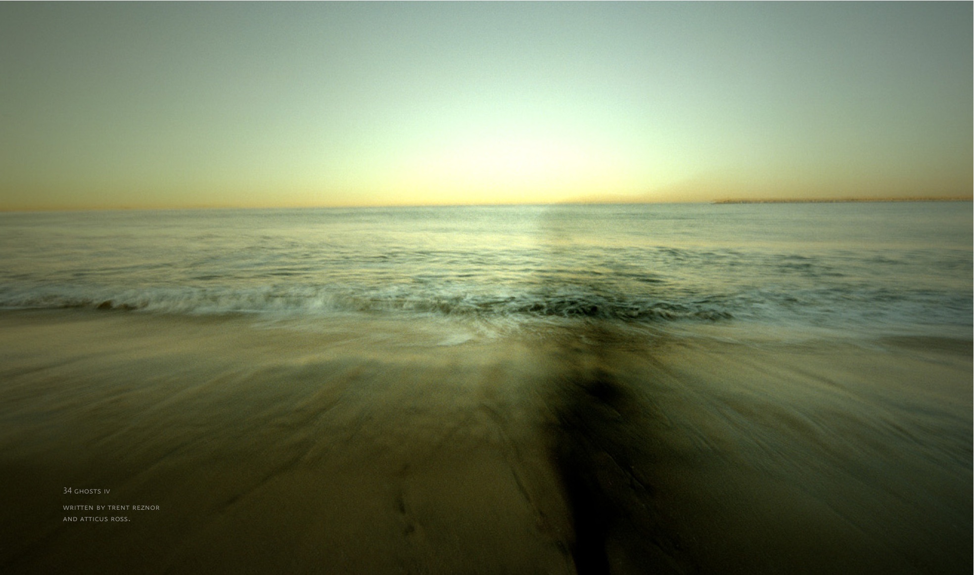
For me, on this day it would have to be this
This artwork paired with the song, it's very moving in my opinion.


 Stubby Member

Can be official, fan art, or whatever fits for you.
For me, on this day it would have to be this
This artwork paired with the song, it's very moving in my opinion.
Throbbing Member
Just talking covers specifically, I always loved this one. Maybe a close second would be March of the Pigs or Hesitation Marks (standard US).
Unintelligible Whispering

Always the first image that comes to mind whenever I think of the 'journey' of TDS encapsulated. Someone shrinking further and further into themself...spiraling inward, feeling very small and insignificant. It may not be the album cover but I love it as something of a statement of intent, I suppose.
Throbbing Member

Let's get this out of the way.
God is an American

 Active Member
the with_teeth era had a huge impact on me and as a dark blue has been my favorite color all along I printed some posters for my wall that I copied randomly from the lyrics sheet back then. For a long time I had the visuals as my desktop background and pretty much else that I could put it on. I still can't get enough of the DNA-like lines and dots accompanied by the digital distortion of that era. Really loved the tour and club shows as well with their artwork that went very well with the press photography during that time (apart from Trent sometimes too gothy-hair).
Re Member
Damn you beat me to it!!!!Originally Posted by joplinpicasso

Yep.
Stubby Member
Yeah this is some awesome artwork. I have the second part of this release and I've always admired the artwork of it. TDS era yielded some awesome visuals for sure and I'd have to agree with you on your point as well.
24.24.2.3171
Yeah, I've always adored that one, too. It helps that that album never actually happened (well, apart from having turned into WT), so the imagination is free to wander down whatever sonic byways it wants while constructing a mental image of the album. In some alternate universe, NIN fans are debating how Bleedthrough fits into their album ranking lists and wondering what that weird album about teeth, which never saw the light of day, would have sounded like.
Anyway, since nobody else has mentioned it yet, I get to say that I've always just loved the juxtaposition of Broken+Fixed. Kind of a cheat since that's technically two covers, but that plus the package design on the CD version of Broken has always totally done it for me.
Last edited by xolotl; 01-17-2017 at 12:49 PM. Reason: "covers," not "colors."
Everything Hits At Once

I've gotta go with Discipline. I have this tattooed on my inner forearm. I just love the design and meaning behind it, plus I get a lot of compliments/inquiries. I really love all of the Slip artwork.
Last edited by Shipley; 01-17-2017 at 01:03 PM. Reason: picture was a bit on the large size
24.24.2.3171
Ah, yeah, I'd somehow forgotten about all the per-track art from The Slip. The reason, in fact, I've got three CD copies of The Slip sitting on the shelf over there. Fantastic stuff, indeed.
 Throbbing Member
It is incredibly difficult for me to pick favorite artwork, so I'll just rate them, I've got three.
1) The Downward Spiral
Iconic by now, perfectly describing the album's dirtiness and just what kind of an unpleasant show you are getting into. It had a huge impact upon me, just looking at the cover while listening to the entirety of the album, just an amazing experience, it feels like the album itself is screaming or crying.
2) With_Teeth
Dark blue with huge NIN logo in the middle while lines start slowly leaking from the logo, making it vanish, the lines almost looking like tears. Pefect cover for a come back, personal one too. As it is the case with The Downward Spiral, it looks like the way it sounds like and conveys the ideas of Trent questioning his place in this world while being sober and more confident.
3) Hesitation Marks (Cargo In The Blood, CD)
Many versions of this artwork, all of them having the same idea with making a call back to The Downward Spiral as Trent looks back upon himself the place he once was, opened wounds.
 Throbbing Member
The song itself is amazing, and the interesting ways that this can all be seen always intrigued me.
i'm too thin
All of the art for Hesitation Marks is fucking great. The many covers, all of the booklet internal art, the standalone pieces by Russell Mills, everything. I'm not sure if it's my absolute favorite, but it's what came to mind when I saw this thread.
Memb, Member, The Membest
I cannot frankly say it's the best artwork ever, but it's always interesting what can be done with monochrome, and how it doesn't mess with your perception or detract you from actual music like some later nin designs.
she/her/hers
there's some unused art that russell mills had intended to be used on the audio version of Closure (when it was planned to do an audio AND video release). i can't find it at the moment but i love it. also, just love all the art from Closure in general. particularly these images
God is an American
I used to think that those wavy vertical lines were dancing figures, or some other kind of distorted human body-outline (I guess thinking of the music video's imagery?) before I looked at it sideways one day and literally slapped my own forehead. "Oh, it's an oscilloscope. DUH!"
Matador de Froot Loops
All Russell Mills artwork for NIN is gorgeous!
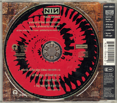
But i always had a soft spot for the "Further down the spiral" artwork:

24.24.2.3171
The real question is: what will the ratio of total posts to number of NIN covers be, once the thread reaches the point of having inlines of literally every NIN cover.
Throbbing Member
Any confirmation on which Ghosts photos are Sheridan's and which are Graybill's?
 Active Member
Uhhhh...uhhhh...well...uhhhh...
I'll have to get back to you on this question.
 Stubby Member
I've always loved the David Carson and Russell Mills artwork for NIN. Their art had a warmer feel, but still had an element that was either disturbing (Mills) or imperfect (Carson). It was art that kept you looking at it and gave you a feel about what you were listening to. I've been following Kraw on Instagram for a long time, so I'm interested to see what direction he takes it!
Rob's stuff was okay for a while, but you can only do "glitch art" and simplistic stuff for so long before it all starts to look the same. Ghosts was great and he took some nice pics, but I think I looked at The Slip artwork one time and put it on the shelf. It didn’t grab my attention or demand any time like I wanted it to. The Welcome Oblivion and an Omen art was lame, but that first EP's cover (that he didn’t do) was pretty wild and cool!! That also happened to be my favorite HTDA release.
 Stubby Member
That With_teeth Poster was cool. I found a copy still online. Download link on page is "*** With Teeth Lyric Poster ***" https://the7thandlast.blogspot.com/2...ic-poster.html
Stubby Member
http://www.nuclearblast.de/static/ar.../1000x1000.jpg
The severely cropped NIN logo and the abstract photography felt very exciting to me when it was released—and it still does.
Throbbing Member
I always preferred the back of The Fragile over the actual cover...
 Active Member
The only Sheridan ones are the in-studio ones, I thought?
There's a bunch here: http://phillipgraybill.com/music-boo...nch-nails/NIN/
Active Member
This disc art is my fav of all time, I think:
 Active Member
http://www.permanence.de/millscat/nin/index.html
These can be found on the new Mills site as well, under totally different titles. I'm thinking about saving them and putting them on the ninwiki Closure page.
 Throbbing Member
Just thinking about this I'd say we're pretty spoilt for good artwork. All the TDS era artwork is just wonderful, but I agree that Further Down The Spiral is particularly beautiful.
Just to go for a different choice though, and for a piece that first sprung to mind when I saw this topic, I'll nominate Things Falling Apart.
Nice, huh?
Dis-member

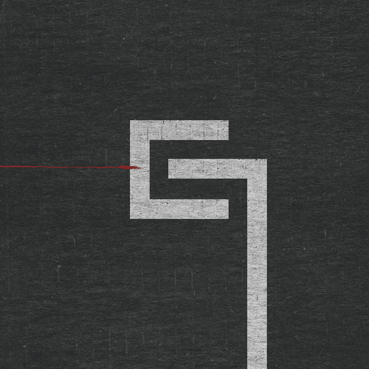
+3 for [With_Teeth] and its era glitch art. Lots of cool stuff, and the album cover has what's probably the best version of the NIN logo.
Worst: NTAE. Hope I don't need to explain the reasons behind this one (spoiler alert: lazy retread)


 Reply With Quote
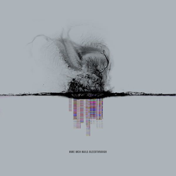
-20141126161407.jpg)