Active Member
 Active Member
 Stubby Member
I really like the aesthetics of this series of 2006 live shows posters, they're kind of a mix between WT and YZ
Sent from my iPhone using Tapatalk
 Active Member
Looking at them, I can't imagine the Broken art being pictures of Trent at all. The sleeve design (incl. photography) is credited to Gary Talpas, as well.
If you ask me, it looks like a close up shot of, like, silk sheets with an orange filter over it. A bit like this.
 Throbbing Member
fucking this. it's such a strong visual statement and says a 1000 words tbh. almost like a painting.
 Throbbing Member
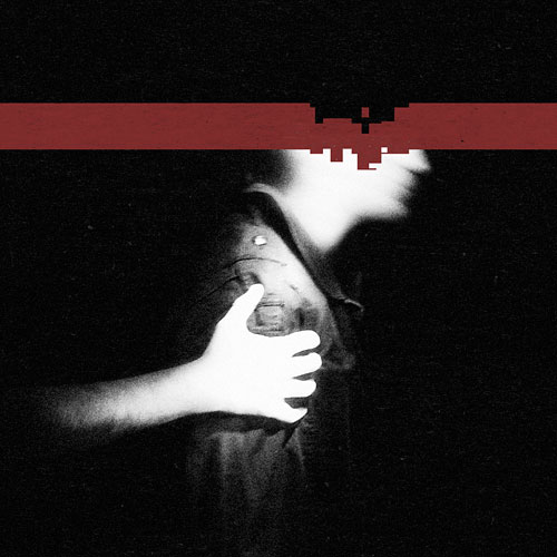
I love it too, is this the only album artwork where Trent actually appears? It makes it seem even more personal.Originally Posted by hani

It's Alessandro Cortini's arm, source: nin.wiki as said by modwheelmood in a Japanese interview
24.24.1.1397

It's the only album cover Trent is on, yes. He has only ever been on the inside of the booklet for PHM, and the inside of the CD case for WT.
 Saul Williams fan.
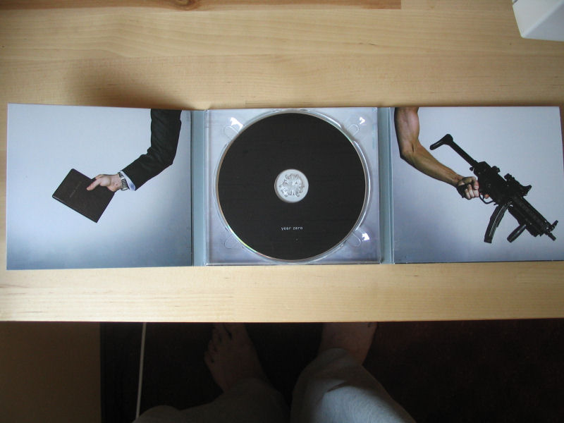
Right, so, I spoke with the IMDb admins and they rectified the situation. This is now the proper page for Year Zero artist Matthew Charles Santoro. Again, very little is known about this guy's work. I haven't seen his contributions being brought up in any Year Zero conversations. The art of Rob, Russell Mills, David Carson and Gary Talpas has been discussed to death, but this guy's art? He made one of the most memorable NIN covers ever, bringing to the YZ concept the blockbuster-like quality that it aimed for.
BEHOLD. OBEY THE PRESENCE.
 Throbbing Member
Sorry for digging up the thread but wow I didn't know those pictures were made this way. And there's a lot that were not released with the album. Those are all gorgeous. thank you.
 Throbbing Member
My favorite NIN artwork is anything from the Year Zero era. Amazing stuff that helped draw me into becoming a NIN fan.
Down, but not out.

While I already mentioned The Fragile, I think just as far as the front album cover art alone goes, Pretty Hate Machine turns out to be my most favorite, since The Fragile got my vote as far as cover art, both inside and out. Anyway, I also still can't decide between the original version and the remastered version. I just love both of them equally.

Last edited by Halo Infinity; 11-22-2018 at 09:55 AM.
Memb, Member, The Membest
I never quite grasped the idea behind changing that cover so much - shift colours, turn it 90 degrees, text in capitals... meh
24.24.2.3171

If you'd never read Rob Sheridan's notes about that, they're super fascinating (IMO) - http://www.nin.wiki/Pretty_Hate_Machine#Artwork
The short version is that the original artwork didn't exist anymore, so they had to completely recreate it from scratch anyway, which led to various new creative decisions being available. Regardless of whether you like the remaster design or not, that link's got a lot of info about the process that went into it.
Memb, Member, The Membest
Yeah, i read that before and still it looks like the final thing could benefit from even more adventurous approach
Throbbing Member
I think it's one of the best cases of changing the art for a remaster ever. It's immediately recognizable without being exactly the same, it updates the cover to match the darker palettes of the band's future albums, and it's not ugly. I don't think it gets much better than that.
 Active Member
This might belong in the controversial NIN opinions thread, but I definitely prefer the remastered PHM artwork. I think Rob & Trent improved on the original cover and made it even better. The colors of the original looks pretty dated to my eyes.
Hairy Member
When I was first introduced to PHM I only listened to and saw the artwork for the remastered version. I was so confused when I finally took note of the original artwork, thinking my boyfriend who showed it to me was playing a joke on me. I didnt think it was possible that the PHM album was supposed to look so bright for being NIN.
 Throbbing Member
I definitely agree. The cover of most NIN albums are fairly timeless and look like they could be from anything, but original PHE just screams "1980's album" to me, especially with that rippled "effect" put over it.
 Throbbing Member
Favorite nin art work... all the content that Alex over at 42Entertainment has put together as Bottom Of The Pyram1d. His work is sick.
 Stubby Member
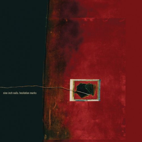
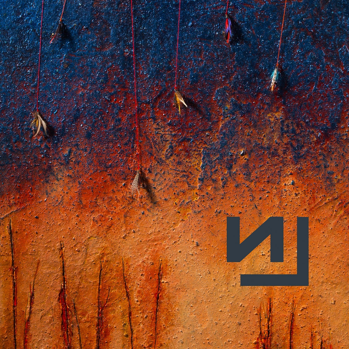
The Hesitation Marks era artwork is pretty sweet, the deluxe edition cover is my favourite piece. The bright orange with the cracks and the cropped NIN logo looks so awesome.
Memb, Member, The Membest
Wait, deluxe edition cover is not orange, it's black and dark red...
one of my favourite too
Last edited by BenAkenobi; 11-25-2018 at 10:49 AM.
Active Member
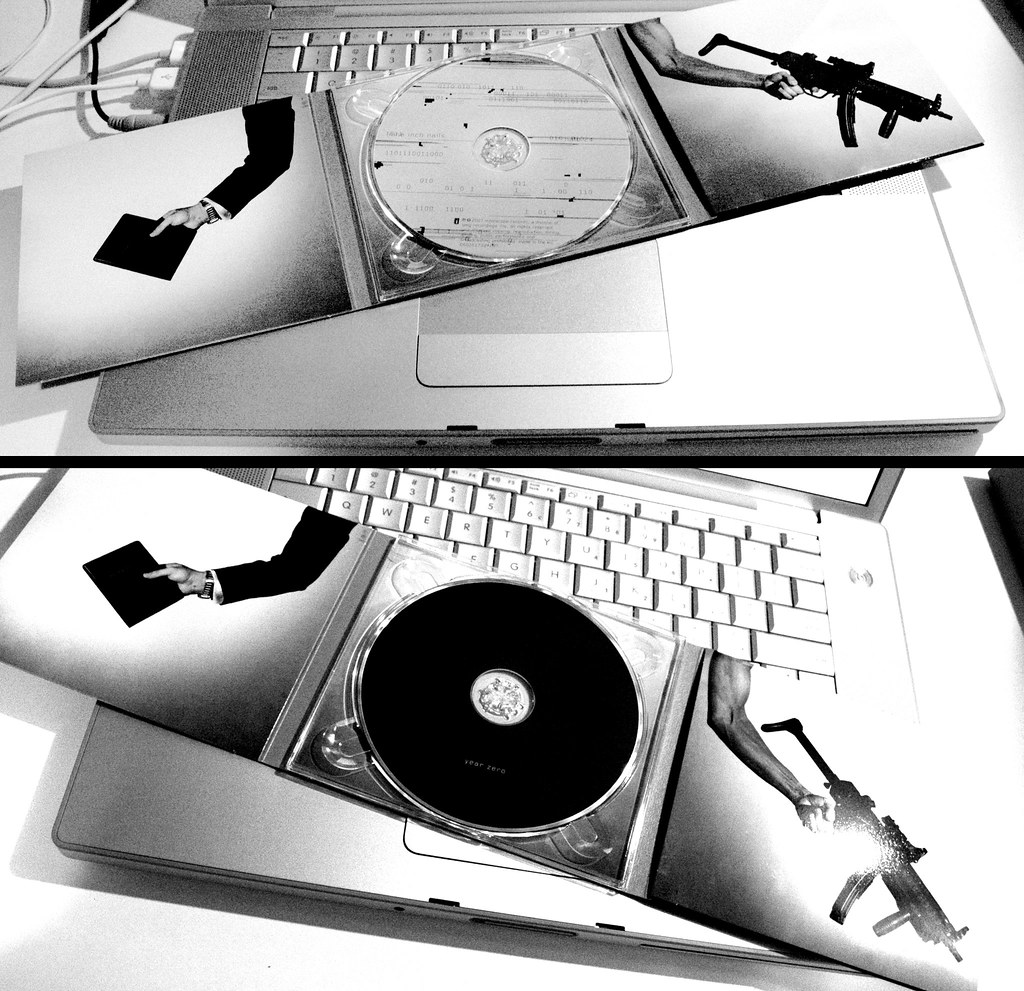
I believe he was referring to the iTunes artwork with the fishing lures:
Flaccid Member

what is your question exactly
dont say i am not looking
Last edited by rossi123; 01-22-2019 at 01:13 AM.
Down, but not out.
I don't know why I didn't post these sooner, but these pictures are also some of my most favorite artwork from Year Zero due to my constant fascination and even obsession of the connection between religion and politics. The one that combines a cross with a gun is also my ultimate favorite as a result, as it just said it all to me.
I also thought that this was just a rather nice touch to it as well.
 Likes:
  Faceplams:

 Reply With Quote