
 Stubby Member


 Saul Williams fan.

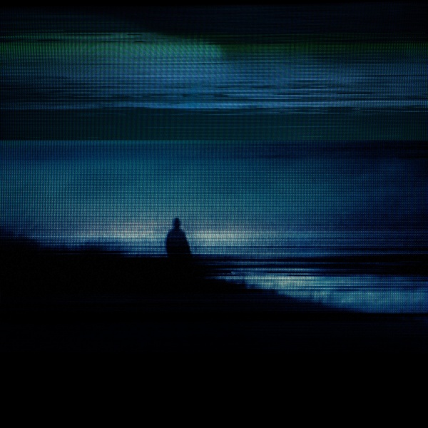
The artwork on Year Zero and YZR was perhaps the closest we ever got to seeing a depiction of the dystopian future of the concept (the blurry, glitchy ARG videos weren't as eye-popping, as they aimed for raw realism). Most of the art was made by Matthew Santoro, a visual effects artist who used to work at Hydraulx and is now making a movie of his own called Higher Power (it's not the YouTube star of the same name, but their IMDb credits are all mixed up). Hydraulx is a visual effects company founded by The Brothers Strause, who have supervised VFX for countless movies. They recently worked on San Andreas and X-Men Apocalypse. If only their expertise had materialized in an actual Year Zero series/film/any audiovisual medium...
Saul Williams fan.
I like to imagine it's the ropes connecting the balloons with the cameras used to film the "dead Trent" in the Down In It music video, just before they broke. That story never ceases to crack me up.Originally Posted by botley

 Throbbing Member

This is hard to decide... the most impressive moment was probably "repainting" that Year Zero "America is born again" webpage to "Another version of the truth".
And as for album covers... Year Zero. :-) Or With_Teeth, and that Bleedthrough too... and Hesitation Marks... all good! :-) But on my desktops is still HTDA "last person on earth" or something, love this style. (edit: found on ninwiki, used for "Keep it together" single)
Throbbing Member
I forgot about that. I love that cover too. That one and the S/T EP are great.
 Throbbing Member
The NTAE black/white artwork is better than the laziness of Broken and Fixed album covers
 Stubby Member
There is also this version floating around that is just the image itself, sans text.

Dis-member

Opnions will vary, but NTAE is a rehash of an approximately 15 year old Still cover. That's pretty much the definition of album cover laziness.
Administrator

The fragile is my favorite hands down. I have a numbered, signed litho that is my prized possession. I would like to be buried with it.
I love most all the artwork except the stuff that included teeth. That shit freaks me out. It has to do with my personal life experience with dental work. A family member gave me a nin shirt with the teeth art on it and I had to pretend to like it. Inside I was mortified!
Sent from my iPhone using Tapatalk
God is an American

You haven't seen the physical album yet, and seem to have made your mind up... pretty much the definition of critical laziness.
Throbbing Member
Definitely The Fragile front cover. By David Carlson.
I have no idea what its about. But it works. That random transition, the half NIN logo, Its just weird.
Reminds me of some of the masterpiece Cocteau Twins artwork on 4AD records.
Throbbing Member
And Broken is just the worst Nine Inch Nails logo with fire behind it (I think?).
The Still covers of NTAE are pretty meh, but I actually really like other covers.
Active Member
The Broken artwork very much seems like a child of its day, I feel. Maybe they could've gone the PHM route and remaster the artwork as well.
Active Member
Yeah, Broken and Fixed get the medal for worst cover. I may not get the point of the NTAE rehashing, but at least I'm fairly certain there's a purpose behind it, a kind of point, even if it's only in the mind of its creators.
Broken's packaging is nice, but every time I put it on my phone I open photoshop up and try to come up with an alternative cover just so I don't even see the thumbnail of the original.
The Downward Spiral and Further Down get my vote for being the most iconic. Personal preference.
The Fragile was a big departure, and even though I'm not a huge fan, it was perfect for the album.
With-Teeth, probably second worst to me. Just too little to chew on with that one, it looks like a DeviantArt fanart. The whole packaging, design, delivery felt lackluster, "here's a disc, the music's on it, we put it between two sheets of cardboard".
Year Zero, well... It's creative, and fitting. I wish they went with the AIR logo instead, or some variation of it.
I love the track artworks for The Slip, and as far as I'm concerned that may be Rob Sheridan's best official work as far as NIN's concerned. But that cover... I'd rather use that one, way more graphically coherent with the rest.
And since I'm a huge Russel Mills fan, I was really happy to see his work make a comeback for Hesitation Marks.
I was nobody. Nothing.
This is sort of hard to do because the artwork conjures up the sounds of the music and even era of your life.
I think as far as pure artwork goes, it's TDS.
But i fucking LOOOOVED the cover of YZ, which (YZ) was, to me, NIN rebooted, and also had this whole HUGE dystopian narrative throughout that i found delightfully terrifying.
Of course, out of context, the artwork doesn't have the same impact.
and see @Khrz , i LOVE the broken cover, but how much of that is because it was my introduction to NIN and means NIN to me more than any other image?
Can i say the year zero trailer? is that cheating?
Last edited by elevenism; 01-19-2017 at 11:08 AM.
 Member
I think my favorite artwork is definitely Halo 9. I just love how it looked and the background. I'm also fond of the packaging for Closure as I still have the VHS tapes. I'm still waiting for a true official release on DVD/Blu-Ray.
24.24.1.1397
In all locations except for the digital files, the NTAE cover is the black/white broken typewriter style artwork. There are 4 versions which are not the Still artwork.
 Hairy Member
Active Member
Hairy Member
Active Member
I don't know if I have a favorite, but TDS and Closer would have to be up there.
For anyone interested, we interviewed Russell Mills (the artist behind The Downward Spiral and Hesitation Marks) on the podcast. I also saw his gallery in LA of the HM pieces. Pretty fucking cool to see those in real life.
http://shoutengine.com/UnderneathItA...view-with-1234
 Stubby Member
I actually really like the Black NTAE cover. I love that it's a "rehash" of Still. But I only like the black. The others don't fit the album at all which, in my opinion, is really important.
As for my favorite artwork... impossible to decide.
 Stubby Member
I've always been drawn to this video for its art installation qualities
 Throbbing Member
I really wish that song's music video was finished. Those bits and scraps we got were phenomenal.
24.24.1.1397
Agreed, probably one of my favorite, if not my very favorite music video. I love macro photography to begin with, but when you splice in some of those beautiful studio shots, you can tell someone went to fucking art school when you see that thing. If I had an assignment to discuss a piece of video work, that would have been it. Which reminds me, do we have the footage that Rob shot for the Tension tour for Into The Void? I know it was a very short clip, but I remember seeing a short video or photo of Rob shooting it (camera on a track, sliding it toward/into/through the vegetation).
bastard from blue city
Uh, what? Is that a real thing? I've never heard that in the last 15 years of fandom. Give me sources! There's nothing on wiki or NINwiki.
Throbbing Member
How can you tell that's what the Broken artwork is without reading up about it? I never knew that, even knowing that I still see just..uh...flames..
Memb, Member, The Membest
Perhaps Trent never said it, but Broken cover could (potentially!) be inspired by Low - which he admitted was among his favourite records.
Active Member
Plus it really totally changes the cover, from "orange blob" to "profound orange blob"... Would be a shame if it had to revert back to being an hideous piece of bad protoshop!
God is an American
Not going to lie: I didn't read the last few posts before scanning over this, and subsequently said to myself "heh, there's nothing profound about Trump."
Last edited by botley; 01-20-2017 at 09:19 PM.
Administrator
I gotta say, Sesqui... that's not ringing any bells. I think the general wisdom on NIN cover art was that none had featured photos of Trent except Pretty Hate Machine - up until With Teeth.
Down, but not out.
I can somehow relate as there were so many things that came and gone with the world of NIN in my mind when digging for facts and overall pieces of information here and there. I totally get what you're saying though as there where times when I found interviews and pictures only to completely forget about them and remember them very vaguely.
If that really is true, and hopefully surfaces if so, that would be pretty cool, considering Burning Bright (Field on Fire) because it could be looked as Trent already being a field on fire, but simply just not realizing it yet. (Perhaps in character and/or real life persona.)
I hate it when that happens too, but it seems bound to happen considering how many things are said about NIN, yet neither confirmed or denied, let known fully known or understood in their absolute context.
As for my favorite NIN artwork, I'd probably have to go with The Fragile, including the entire booklet. I've always seen it as very complimentary eye candy to the actual music itself.
(That is, if I were to just pick one album out of them all as far as artwork goes as of right now.)
Last edited by Halo Infinity; 01-20-2017 at 10:44 PM.
 Likes:
  Faceplams:

 Reply With Quote
:format(jpeg):mode_rgb():quality(90)/discogs-images/R-951224-1231169784.jpeg.jpg)
