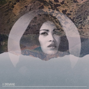
Heh.
The way I see it, it's like commissioning Dalí to do the artwork for your album, and instead of giving you something relevant to your music which still smacks strongly of his signature smile, he slaps down The Persistence of Memory on your desk with a picture of one of your band members melting from the branch in place of that clock. Granted, Weaver's work for the EP isn't that much of a copy of his other work, but as butter_hole so succinctly put it, when you look at all of his images together it's not so much a theme as the same idea rehashed repeatedly with slightly different subjects. Photographers and artists have this wonderful way of putting out pieces that can look completely different but still show a signature style. The circles, mountains and portrait 'theme' Weaver uses is akin to a photographer posing every one of his subjects in the same manner in front of the same background, just in slightly different colours. While that would make for a cool series, it's not really sufficient to buoy an entire career.
From a purely aesthetic perspective, I don't see anything wrong with the artwork for the EP or the single. It just seems a bit dull that he put out the exact same template for the work he's been doing over the years, just with slight variations to make it relevant to the band (and that relevance becomes tenuous when it comes to the EP, since there's no picture of Mariqueen's face slapped on it).


 Reply With Quote

